Process
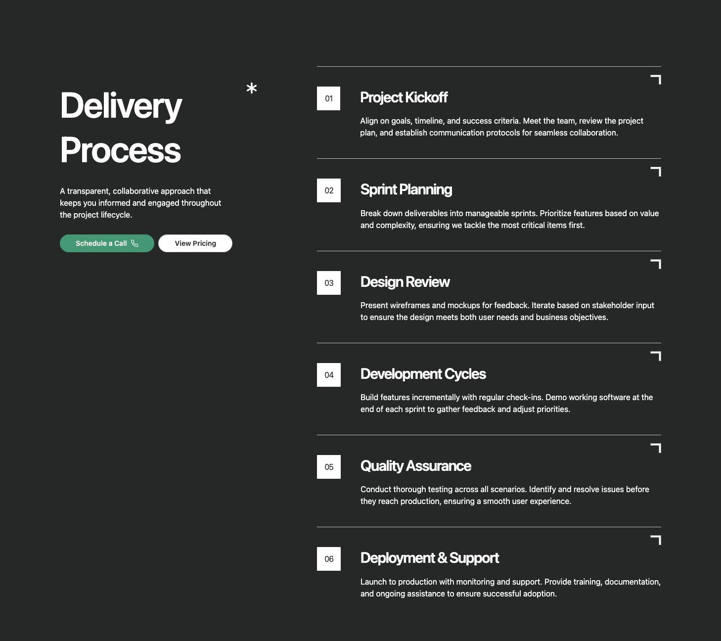
A process section with a sticky left sidebar containing title, description, and CTA, paired with a scrollable right column of numbered step cards. Each step features a decorative corner illustration and displays step number, title, and description. Ideal for showcasing methodologies, workflows, or multi-step processes.
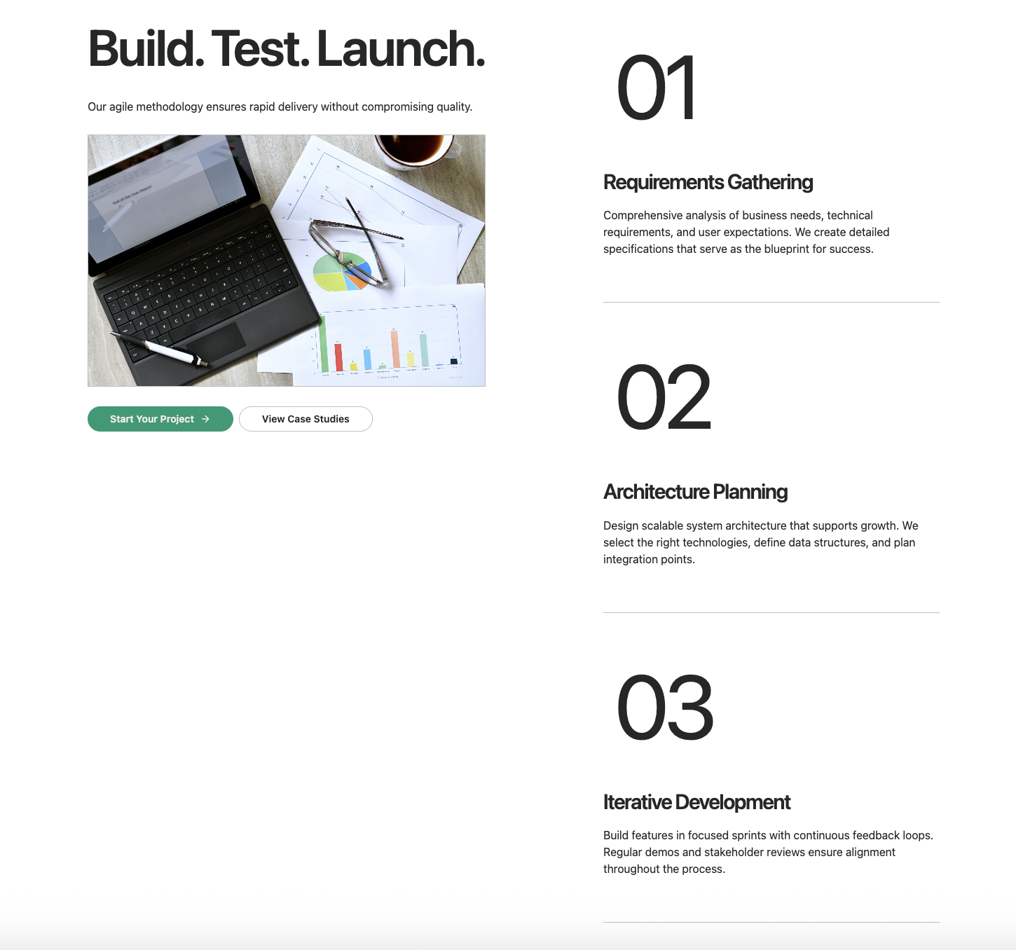
A scroll-triggered process section with a sticky left panel containing title, description, animated image carousel, and CTA. As users scroll through the numbered steps on the right, the corresponding image animates into view with a clip-path reveal effect. Perfect for visual storytelling and step-by-step guides.
A process section with hover-activated cards that reveal floating images on desktop. Each step displays a mono-font number, title, and description with smooth hover transitions. The floating image appears with a fade-in animation when hovering. Ideal for interactive process showcases and service overviews.
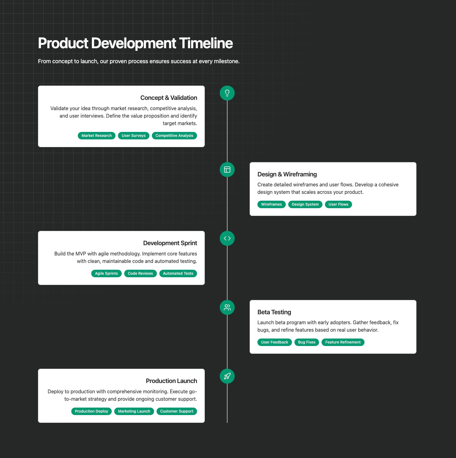
A vertical timeline with colored icon badges and alternating left/right card layout. Each step features a customizable colored badge with icon, title, description, and optional highlight tags. The timeline line connects all steps visually. Perfect for detailed process flows, project phases, or methodology explanations.
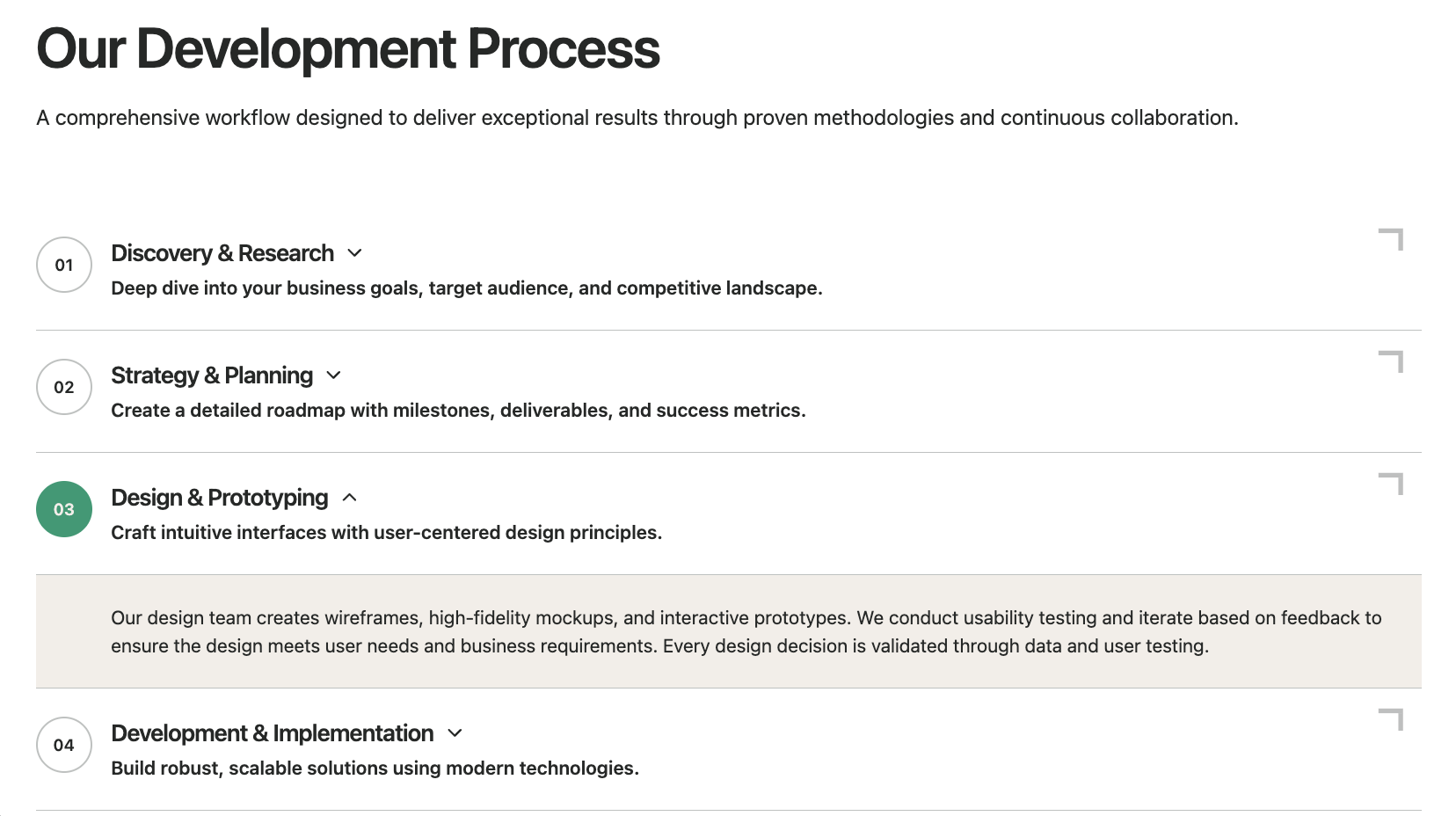
A clickable timeline with expandable content sections. Each step shows a numbered badge, title, and brief description that expands to reveal detailed content when clicked. Features smooth height animations and decorative corner connectors. Ideal for FAQ-style process explanations or detailed methodology breakdowns.
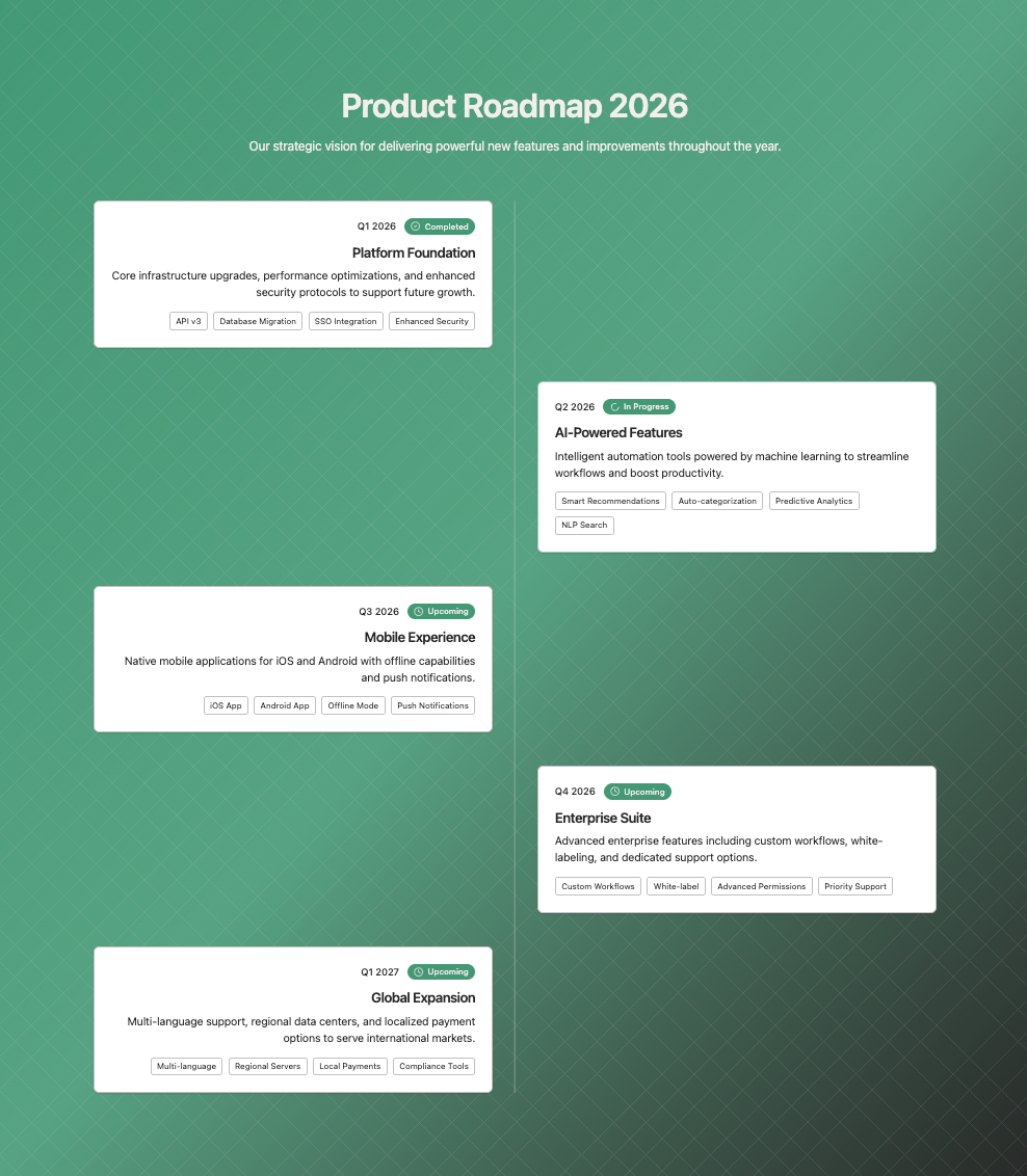
A product roadmap timeline with status badges (completed, in-progress, upcoming) and milestone cards. Features alternating left/right layout, date labels, feature tags, and visual status indicators. The timeline line connects milestones with numbered or checkmark badges. Perfect for product roadmaps and project timelines.
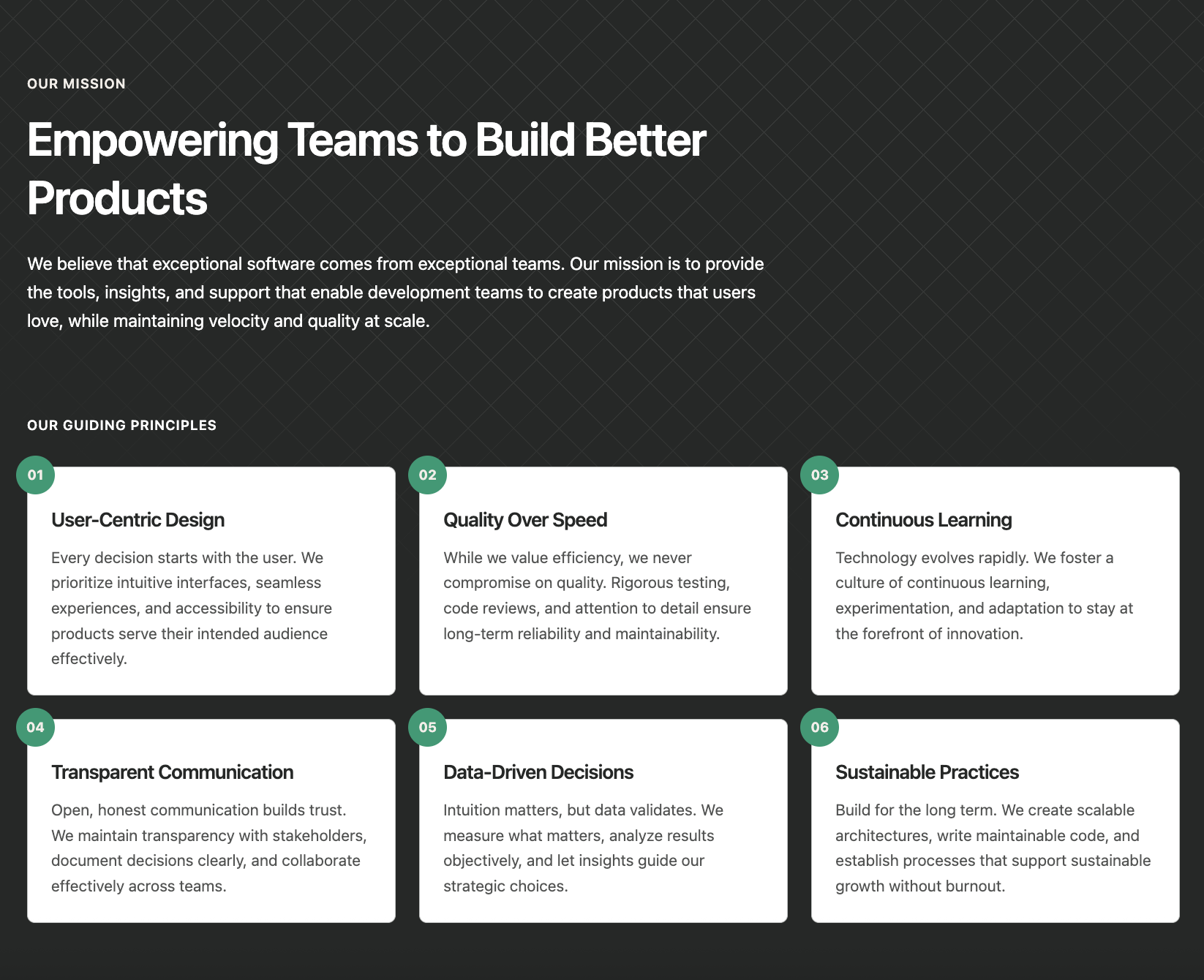
A mission statement section with a grid of numbered principle cards. Features a prominent mission title and description followed by a responsive grid of principles, each with a floating number badge, title, and description. Ideal for company values, guiding principles, or core beliefs sections.
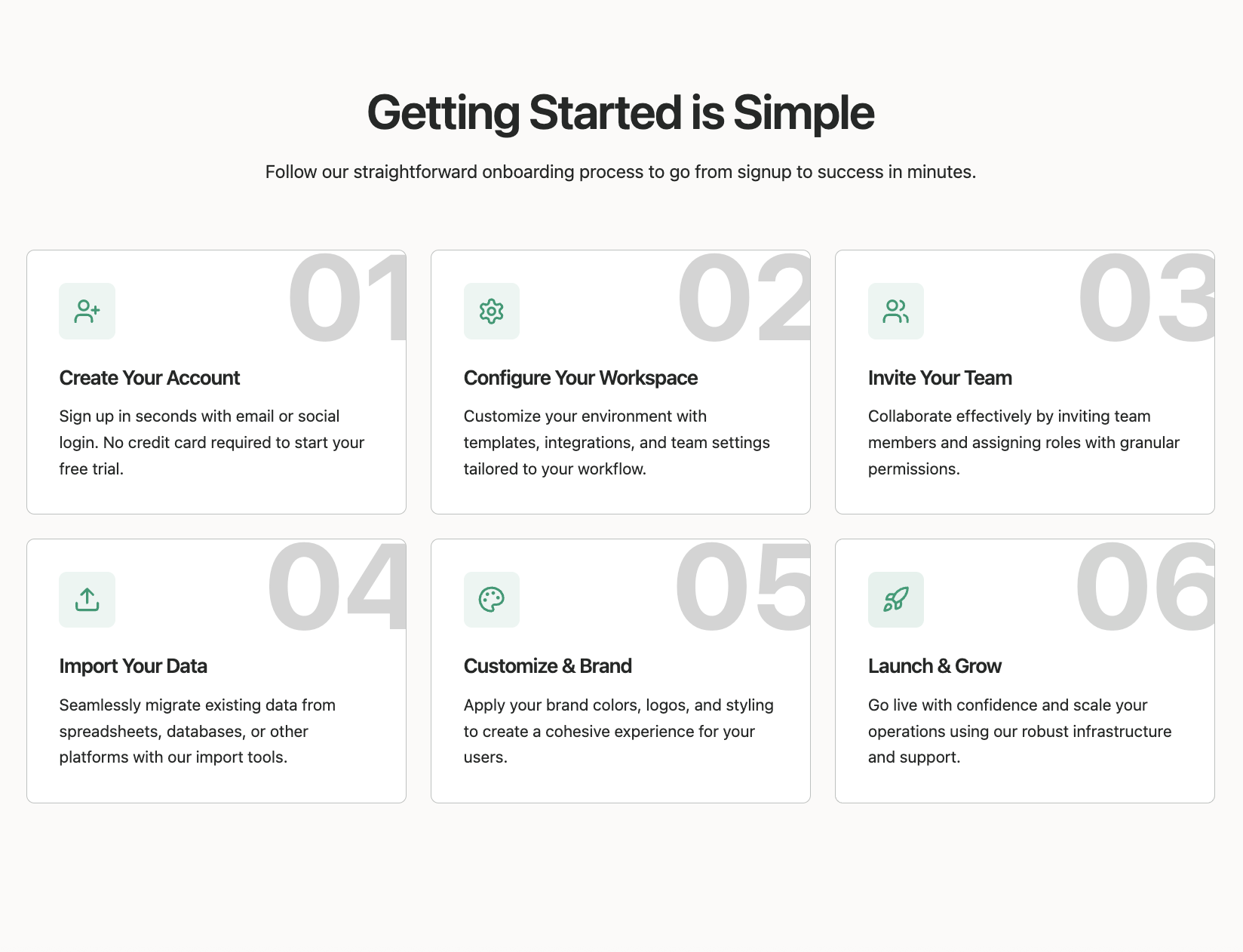
A grid layout of process step cards with large background numbers and icons. Each card features an icon in a colored badge, title, description, and a decorative oversized step number in the background. Hover effects highlight the active card. Perfect for showcasing methodologies, service processes, or workflow steps.
A services section with large numbered circles and capability lists. Each service displays a prominent number badge, title, description, CTA link, and a grid of capabilities with checkmark icons. The layout uses a 12-column grid for flexible content arrangement. Ideal for service offerings, capabilities, or solution pages.