Carousel

A fullscreen section carousel with smooth animated transitions between slides. Features click-to-advance navigation, progress indicators, and content overlays with CTAs. Perfect for immersive storytelling experiences.

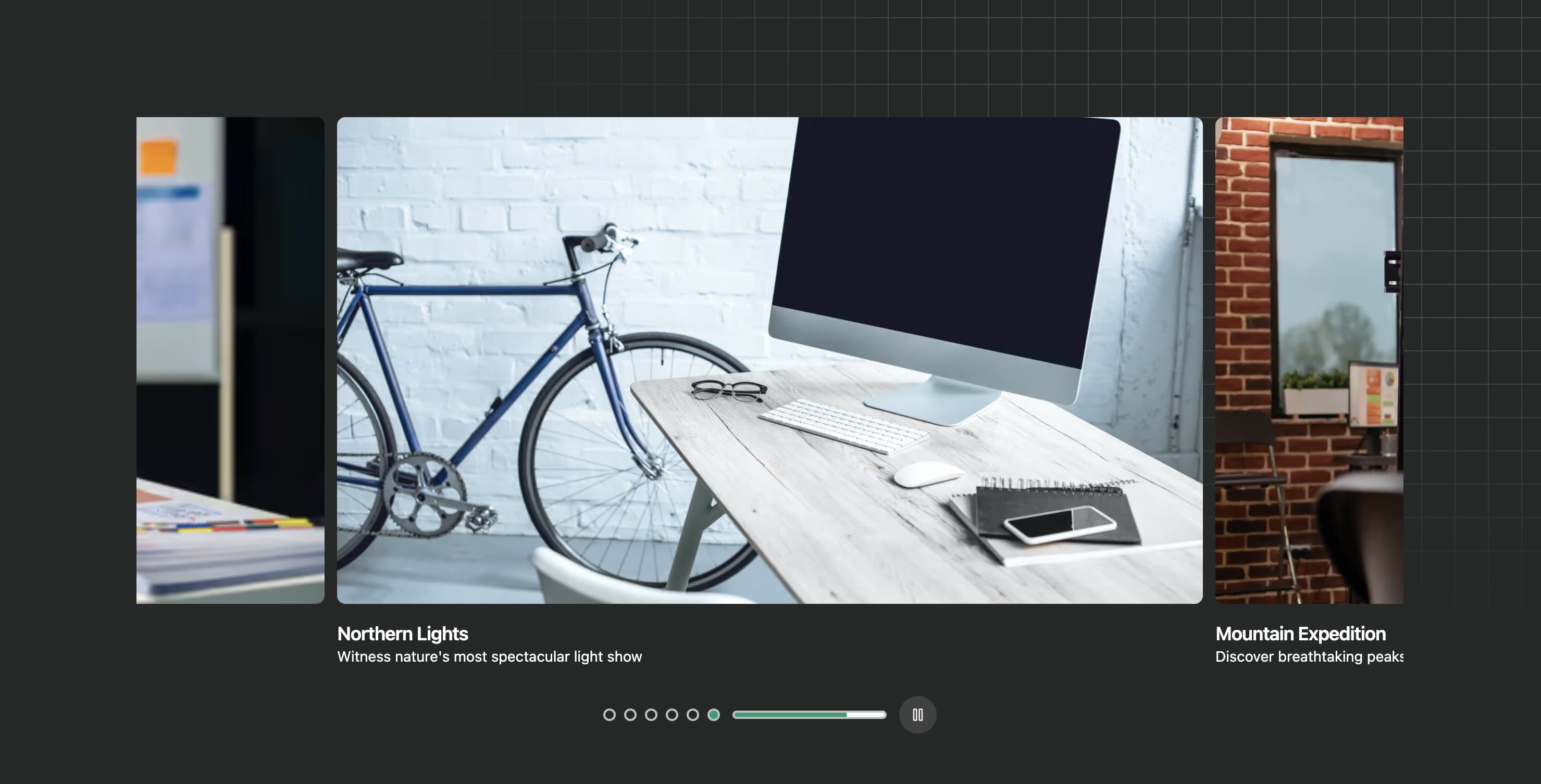
An auto-advancing carousel with animated progress indicators and smooth blur transitions between slides. Features centered headline, navigation controls, and visual progress dots that fill as each slide auto-advances.
An Embla-powered carousel with autoplay functionality, animated progress bar, dot navigation, and play/pause controls. Features smooth transitions with visual feedback for autoplay timing.
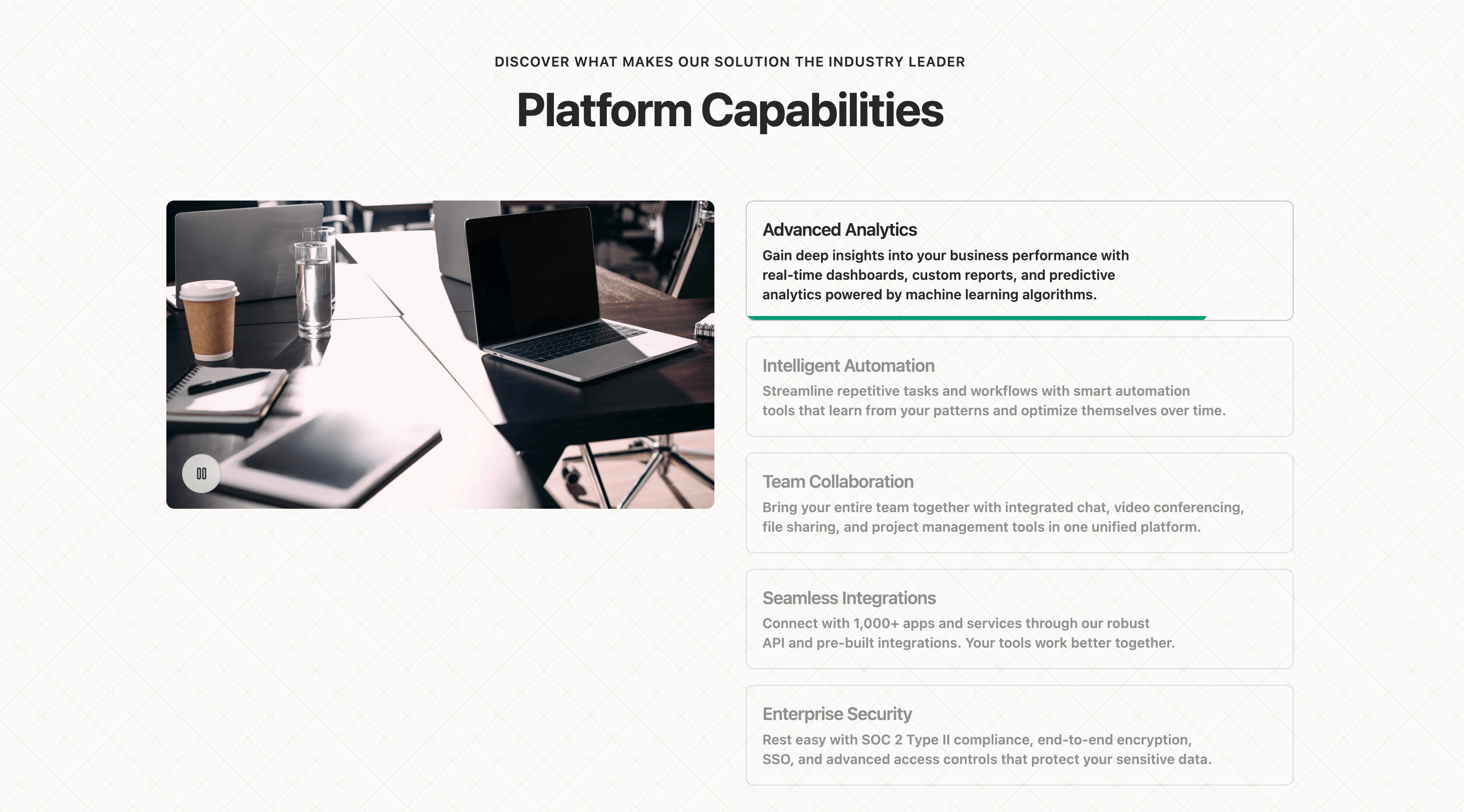
A two-column feature section with badge label, headline, description text, and an interactive carousel showcasing platform screenshots or feature images. Includes previous/next navigation controls.

A GSAP-powered fullscreen carousel with scroll-triggered animations, pinned sections, and smooth parallax effects. Features immersive full-viewport slides with overlay content and navigation indicators.

A gallery carousel with main image display, thumbnail navigation strip, keyboard navigation support, and auto-play functionality. Features smooth slide transitions with caption overlay and responsive thumbnail grid.

A horizontal scrolling card carousel with animated entrance effects, navigation buttons, and stat displays. Features smooth scroll behavior with dynamic button visibility based on scroll position.

A full-width hero section with an auto-advancing background image carousel, overlay content with headline, description, and call-to-action button. Includes navigation arrows and dot indicators for manual slide control.
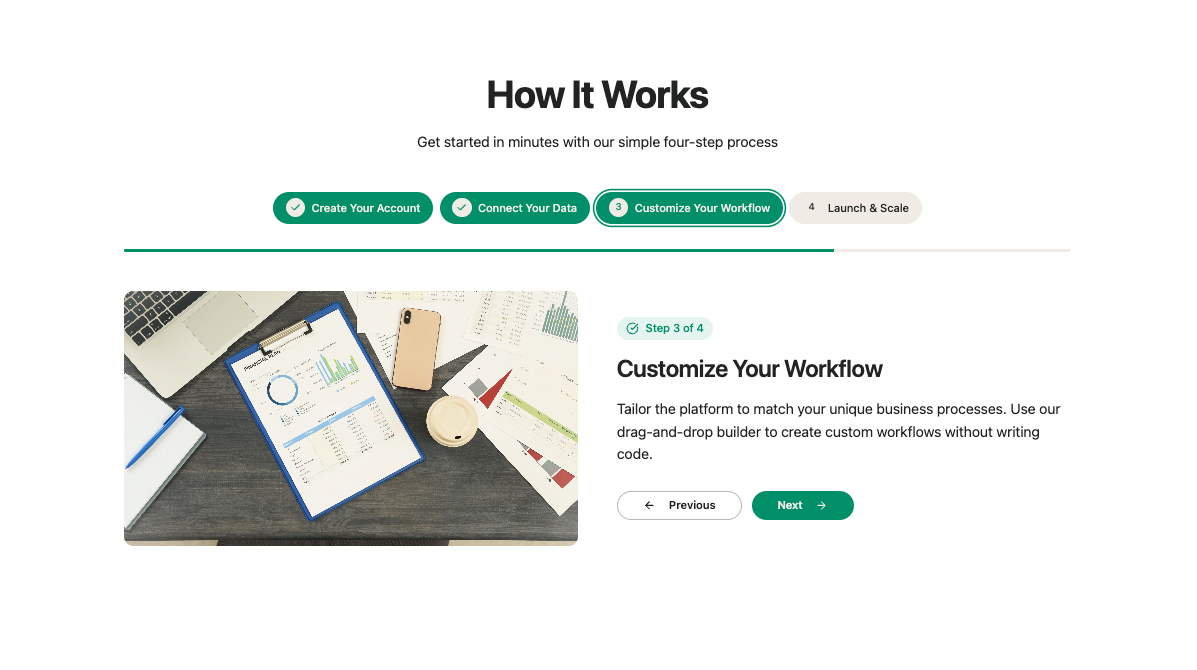
A multi-step feature showcase with animated step navigation, progress indicators, and synchronized image transitions. Features numbered step buttons with active state highlighting and smooth content transitions.

A fullscreen portfolio hero section with auto-advancing image slider, gradient overlay, category tags, and navigation controls. Features smooth opacity transitions between slides with slide counter display.

An interactive product feature carousel with mobile-responsive design, color variant selectors, and animated transitions. Features a split layout with product imagery on one side and feature descriptions with navigation on the other.
A context-based slider with animated progress bar indicators for each slide. Features auto-advancing slides with visual progress feedback and smooth transitions between content panels.
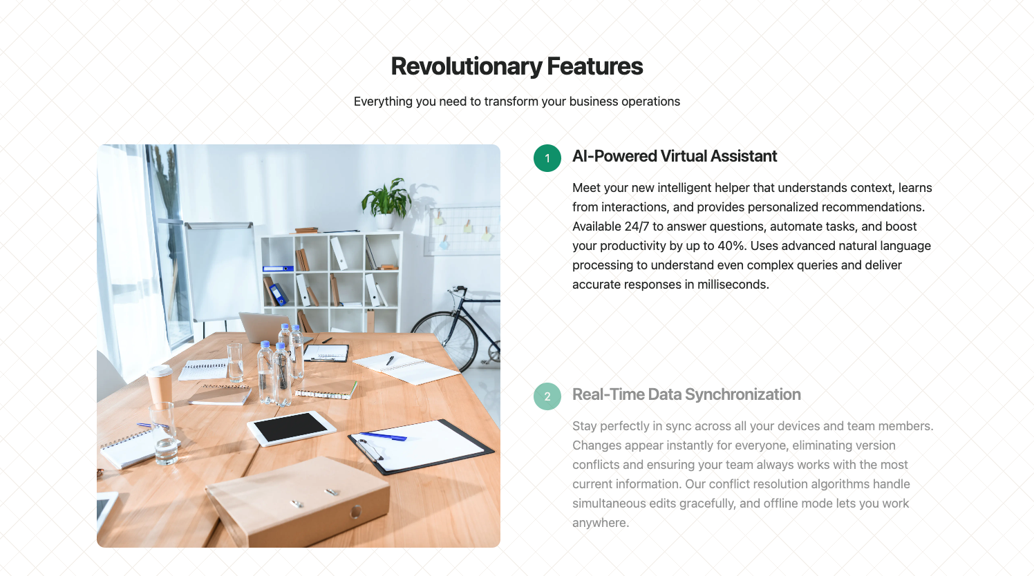
A scroll-driven feature showcase with a sticky image panel that updates as users scroll through feature descriptions. Features smooth transitions between feature images with intersection observer-based activation.